
Uber Eats kept sending me away from home. So I built the fix myself.
An Android assistant that tells you, above every offer, whether the drop-off moves you toward your destination. What it does, what building it took, and what's next.

About a year and a half ago I was driving Uber Eats a lot: nights, and especially Fridays.
The orders were often good. Sometimes really good. But they had one habit I couldn't get rid of: each one pulled me a little farther from home.
At the end of the night I'd close the app and face a 30+ mile drive home with nobody paying for it. That's gas, wear on the car, and the last hour of my evening, all unpaid.
One night on that drive I thought:
What if I could set a destination, say Home, and see right away which offers are taking me that way?
Uber doesn't have that feature. So I built it.
What it does
Tailwind Drive is an Android assistant for Uber Eats drivers. You set your destination once. When an offer comes in, a small banner appears above it:
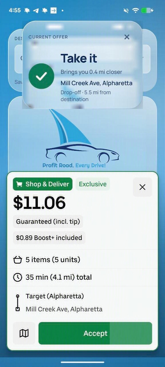
You still decide. Tailwind just answers the one question the offer card doesn't: where will I end up compared to where I want to be? Miles and pay are already on the card. Direction isn't.
On October 6, Google approved it for public release. 🎉 I use it on my own shifts.
What building it actually involved
The idea is one sentence. The build had a few surprises.
The offer card isn't shared with other apps
My first plan was to read the order the normal way Android lets assistant apps read the screen. On a real phone, during a real shift, the offer card came back empty. So Tailwind reads the card the way you do, from what's on the screen, and it does that entirely on your phone. Early on I tested a cloud AI model for this step. I dropped it. It was slower, and I didn't want screenshots of anyone's work leaving their device. Your location is also used only on the phone, to work out direction.
I measured the speed instead of guessing
A verdict that arrives after you've already tapped Accept is useless. When the banner felt slow, I timed every stage on a Pixel. Grabbing the screen took tens of milliseconds. Reading the text took up to a second. Looking up the address took about a third of a second. Now the banner shows up immediately and says "Reading the offer" until the verdict is ready, so you're never staring at a blank screen.
Google rejected it twice before approving it
Apps that read the screen get reviewed strictly, and that's how it should be.
- First rejection: three issues under the accessibility policy. The biggest one was my consent screen, which had a checkbox and a single button. Google requires a real choice. Then, on an actual 1080×2400 phone, my redesigned "I don't agree" button ended up below the bottom edge of the screen. A choice you have to scroll to find isn't a real choice. Now both buttons sit side by side, and saying no takes you straight into the app with nothing turned on.
- Second rejection: a reviewer tapped Subscribe during the free launch period, and the purchase failed silently on their test device. To them it looked like a dead button. My first instinct was to hide or grey out the plans while everything was free. Then I realized that's exactly how a free app starts to feel like a bait-and-switch. The honest fix was plans that actually work, with "Free until Nov 15" shown as your current plan right next to them.
I cut features on purpose
I had a $/mile filter fully designed in August, and I left it out of version 1. Two features at once would have blurred the one thing I can explain in a sentence: this offer is on your way. I also chose not to factor in the pickup location. The pickup affects cost. Direction is about where you end up. Mixing the two would have marked good orders as "no".
When it's wrong, you can tell me without giving up your privacy
Settings has a "Report a wrong verdict" option. It builds the email, and you see every line before sending. It includes the coordinates of your destination, not your home address.
What's next
The $/mile filter is coming back in the next release. You choose the minimum pay per mile that's worth your time. Mine is about $2. Anything below that isn't worth it for me.
Picture it: you finish your day job, open Uber Eats in the evening, and only take offers that pay well and bring you closer to home. That's the whole point.
Further out, I'm considering an offer log ("47 offers this week, took 12, declined 31 under $1/mile") and, once there's enough of your own data, your best hours and areas. I'm also aware that iPhone drivers exist. That version is coming, but iOS works very differently, so it's a separate project.
Pricing, honestly
Here's how I think about it. By my own estimate, one empty 15-mile drive costs around $10 in gas and wear, plus half an hour of your life. If Tailwind saves you from just one of those drives, it has more than paid for itself.
Why I'm sharing this
I don't have an ad budget. What I have is a tool I built because I needed it, use myself, and believe can help other drivers.
If you drive Uber Eats on Android, try it and tell me what's off. Wrong verdicts, confusing screens, features you'd want. Every report goes straight to me, and that's how the next version gets built.
This is only the beginning. 🚀
Free until November 15. Set your destination and see which offers take you there.
